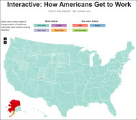
 FlowingData has posted an interactive map of the United States showing the estimated percentages of mode of travel to work by county. The website "explores how statisticians, designers, data scientists, and others use analysis, visualization, and exploration to understand data and ourselves."