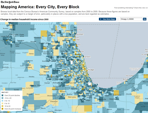
The New York Times recently created an interactive map featuring local data from the Census Bureau's American Community Survey based on samples from 2005 to 2009. The map, which can zoom to any address, zip code, or city in the U.S., allows users to view a range of maps displaying data on race and ethnicity; income; housing and families; and education. To see even more data mapped, graphed, and charted for the Chicago metropolitan region, visit MetroPulse. The new regional data resource was created through the Regional Indicators Project, a collaboration of CMAP and The Chicago Community Trust.
